

Bering Sea Fisheries Brand & Packaging
I collaborated with another designer on the creation of the Bering Sea Fisheries logo and designed packaging for crab distribution.
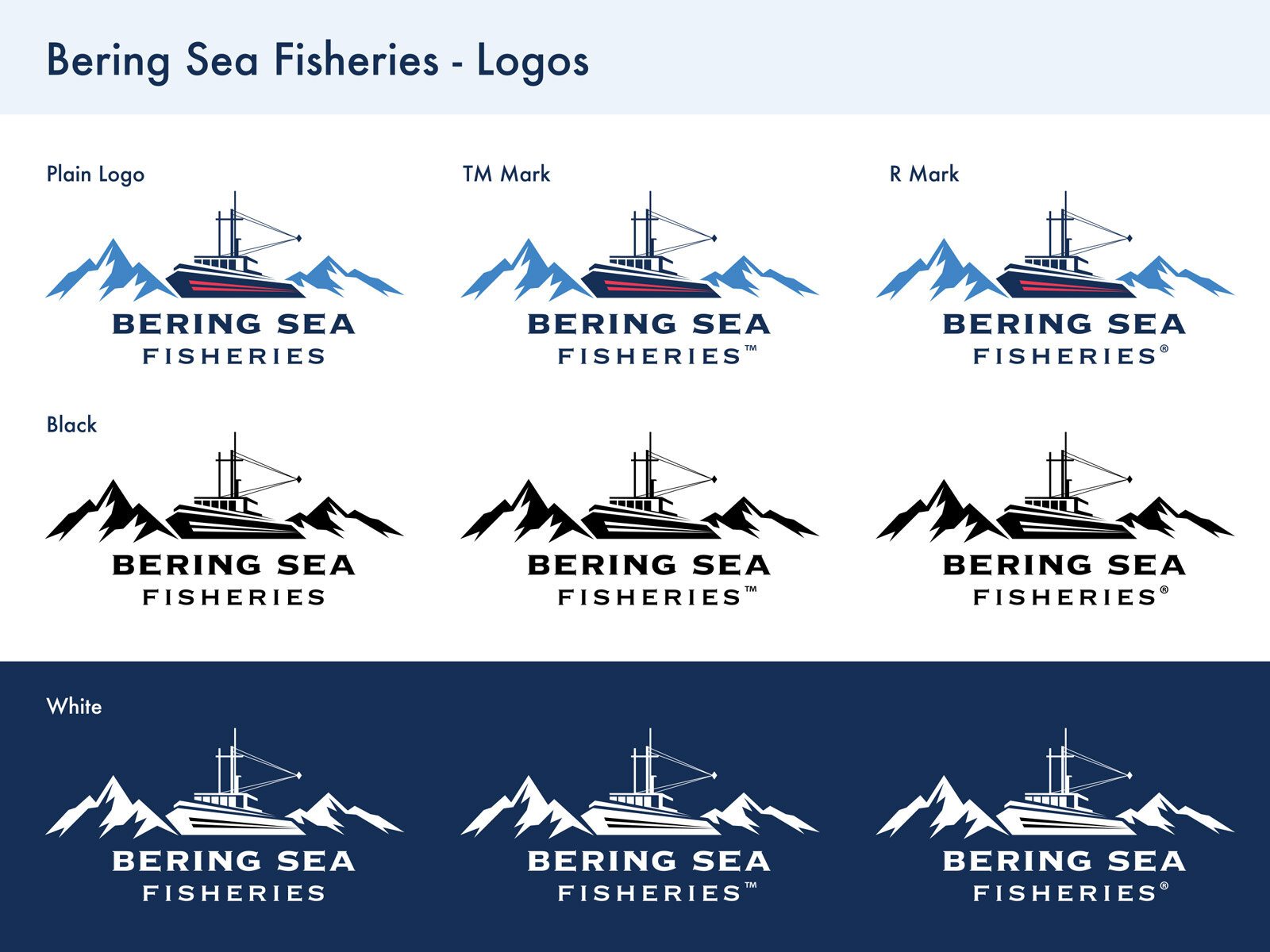
The client had a few different elements in mind that they wanted to incorporate in the logo drafts: crab, a ship, and something that would associate with the surrounding area of the Bering Sea.
First drafts of the logo included versions with a crab, another one with a fish and an old-fashioned steering wheel, and an option with a moving ship and mountains. The client decided that the ship and mountains are the elements that would represent his brand best.
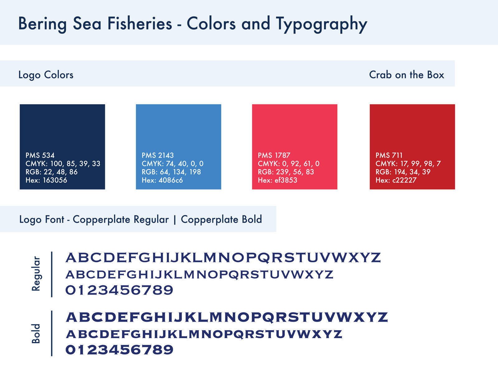
With a help of another designer, we finalized a design with clean and sharp edges that show movement and speed. Two shades of blue create a contrast between the elements, putting more emphasis on the ship. The accent pink-red lines add a sense of speed.
For the packaging, the client wanted a simple design that clearly represents what’s in the box - crab. Instead of using cut-out photographs, I decided to draw a detailed sketch of a pacific king crab. The artwork covers two thirds of the box and bleeds over the edges of the top panel of the box. The color scheme is similar to the Bering Sea Fisheries colors - signature dark blue and a bit darker shade of red to illustrate the crab.